As foreshadowed in Australia's latest population statistics - introduction, this post begins a review of the latest population data from the Australian Bureau of Statistics released in September 2008, focusing in this post on the macro numbers.
While I will be discussing the macro numbers, I am particularly concerned with the implications of the numbers for previous analysis I have done in a NSW and New England context.
Data Qualifications
As with all statistics, care needs to be exercised in interpreting the results. Some of the numbers are preliminary and will change. Further, and as I discussed in Sydney, statistics and the need for caution, the definitions used in defining statistical areas can also affect results. In particular, the Sydney Statistical Division is far broader than Greater Sydney as normally defined.
Overall Pattern
The Table below sets out estimated figures by state and territory for the year ended 30 March 2008.
| State | Population '000 | Change over previous year '000 | Change over previous year % |
| NSW | 6,947.0 | 72.4 | 1.1 |
| Victoria | 5,274.4 | 87.6 | 1.7 |
| Queensland | 4,253.2 | 91.9 | 2.2 |
| WA | 2,149.1 | 54.2 | 2.6 |
| SA | 1,598.0 | 16.9 | 1.1 |
| Tasmania | 497.3 | 4.5 | 0.9 |
| ACT | 342.7 | 4.6 | 1.4 |
| NT | 218.4 | 4.6 | 2.2 |
| Total | 21,282.6 | 336.8 | 1.6 |
The numbers show that Queensland and Victoria are continuing to catch up on NSW in population terms. While WA's growth rate is the highest in the country, its lower population base means that (in absolute terms) it is still losing ground to the three big eastern states.
The growth in the NSW population, while still the second lowest in Australia in percentage terms, is in absolute terms well up on the 59,630 growth recorded in the 2005-2006 financial year, the base I was using in my previous analysis.
Importance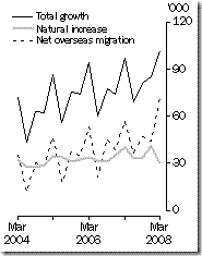 of Migration
As evidenced by the ABS graph below, Australia's higher population growth in the year ended 20 March 2008 was driven very heavily by a sharp increase in migration.
If you look at the gray line for natural increase, this has fluctuated around a straight line trend. Consequently, the rises and falls in absolute population numbers are driven almost exclusively by net overseas migration.
I am not sure that the next graph will come out properly upon publication. It shows the contribution of overseas migration, internal migration and natural growth for each state and territory.
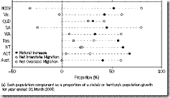
NSW gains population from migration and natural growth, but continues to lose people through internal migration at a greater rate than any other state. Consequently, NSW's population growth is almost completely dependent on the size of Australia's migration program. The increase in the rate of NSW population growth above that I used in my earlier analysis is solely due to increases in overseas migration.
This has been a feature of NSW for a very long period, from at least the late eighties.
More broadly, the existence of varying patterns of internal and overseas migration within Australia is actually changing the ethnic mix of the country in a geographically based way that we have not seen before.
As I will discuss in a later post, this is especially pronounced in Sydney because the city acts as a magnet for overseas migrants while combing heavy out migration to other parts of Australia.


No comments:
Post a Comment